
Creating an Interactive 3D Floorplan in Home Assistant
If you haven’t created your floorplan image yet, I’d recommend you take a look at my previous post on how to use Sweet Home 3D to create your floorplan. To create our interactive floorplan we will be using a picture-elements card. I’d recommend reading Jaun’s write up on using picture elements to create a 2D floorplan using a picture-elements card.
In the remainder of this post I will document the basic code and configuration as well as diving into some of the specifics for more advanced functionality.
Creating the Images
To get started you will need two 3D renders of your floorplan. The first should be with all of the lights on and the second should be with all of the lights off. If you want more accurate lighting when you have multiple lights in a room you can also go wild and create a different render for every combination of lights on/off in a room. That was a bit overkill for me, so I instead decided on 2 renders and using some photo editing software like gimp to create images of rooms with the lights off.
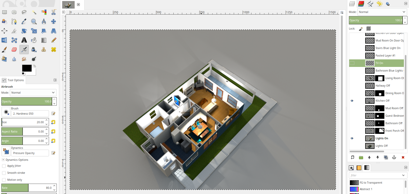
I ended up creating layers on top of the base image which I decided would be the floorplan with all of the lights on. I then created a new layer for each room with the lights off by duplicating the lights off layer and deleting any part of the duplicated layer that was not part of the room I was creating the image for. See the example below of the layer for the kitchen with the lights off.
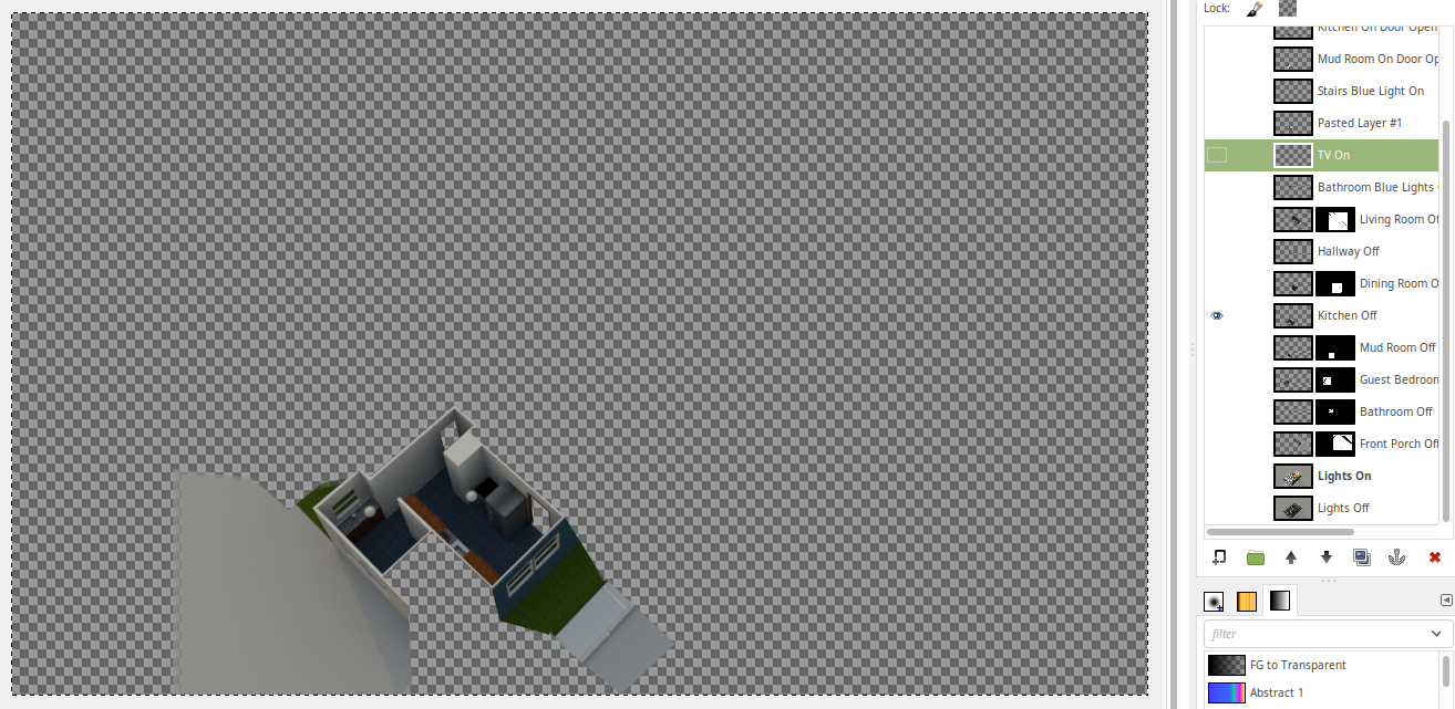
The image above will be layered on top of the base image with the lights on and will be toggled in homeassistant in order to show the lights on or off in the kitchen based on the state of the kitchen lights. You will need to repeat this process for each room in order to generate all images of the rooms with the lights off. You will want each of these images to be the exact same size as the base image. In my case I ended up with 28 total images.
Adding a Floorplan View and Toggling Lights
Below is a concise example of how to create a view for your floorplan that will
allow you to toggle the lights in the kitchen. They will turn on/off based on
the state of light.kitchen in home assistant.
title: Floorplan
path: floorplan
panel: true
icon: mdi:floor-plan
cards:
  - type: picture-elements
    image: /local/first_floor_lights_on.png
    elements:
      # Lighting Overlays
      - type: image
        entity: light.kitchen
        tap_action: none
        hold_action: none
        state_image:
          "on": /local/transparent_square.png
          "off": /local/first_floor_kitchen_lights_off.png
          "unavailable": /local/first_floor_kitchen_lights_off.png
        style:
          top: 50%
          left: 50%
          width: 100%

      # Light Toggles
      - type: image
        entity: light.kitchen
        tap_action:
          action: toggle
        state_image:
          "on": /local/transparent_square.png
          "off": /local/transparent_square.png
          "unavailable": /local/unavailable.png
        style:
          top: 71%
          left: 40.5%
A few things to note about the above example:
- Set
panel: truefor your view. This will allow it to take up the entire viewport and ensure that the layered images properly line up when you set the css style attributes for placement of the button to toggle the light. - For each light overlay set the
tap_actionandhold_actiontonone. If you do not do this, the entire image will be clickable and only toggle the last overlay in your list. Instead we will add a light toggle of a small transparent square that will sit on top of the light in the picture. This way we will be able to click on a small portion of the image to toggle the state of the light. - The
onimage for thestate_imageof each lighting overlay should also be set to the transparent square image. This will let the base image show which has the lights on. - Specifying an
unavailablestate for the lighting overlay will prevent an ugly broken image from displaying in the middle of your floorplan. The transparent square image is used for the unavailable state so that we see the floorplan as normal when the entity is unavailable. For the toggle we also specify anunavailablestate, but for this one we use the same image as the transparent square except I added a red border around it. This will cause the the toggle to be highlighted when it is unavailable so that you can fix it. I’ve had this happen several times when I manually renamed an entity in the configuration and forgot to update it in my floorplan. Credit to Sp4wN’s post in the community forums for pointing this out. - Note the
styleattributes for the lighting overlay. These values will be the same for each overlay image. - Ensure that you put all of your lighting overlays at the top of your view. All of the toggles should be below your overlays. If you do not do this, then you will not be able to click on any of your toggles. So the order matters.
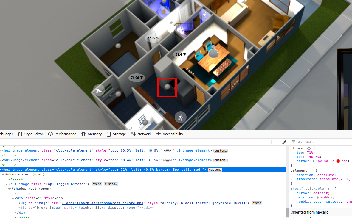
In order to accurately place the transparent square over top of the portion of
the image you want to click on you will need to set it’s position in the style
portion of the the toggle image. I used the chrome or firefox developer tools
to find the transparent_square.png image then adjust it’s CSS top and left
attributes until it’s centered over the light that I want to click. In order to
make it easier to see I added a red border in the style until I found the correct
position. For example:
- type: image
  entity: light.kitchen
  tap_action:
    action: toggle
  state_image:
    "on": /local/transparent_square.png
    "off": /local/transparent_square.png
    "unavailable": /local/unavailable.png
  style:
    top: 71%
    left: 40.5%
    border: 5px solid red
The code above will result in the image you see below. You can then freely adjust the attributes until it’s in the desired location and then remove the border from your configuration.
Creating a Floor Toggle
Creating a button to toggle the floor was something I struggled to find solutions for. After some investigation I settled on using an input select in combination with a conditional card. Then on each card view I added a service button which toggles between the floors.
First I created my input select in configuration.yaml.
configuration.yaml
input_select:
  floorplan_floor:
    name: The select floor to show when viewing the floorplan.
    options:
      - "1st Floor"
      - "2nd Floor"
    initial: "1st Floor"
    icon: mdi:floor-plan
Next I modified my floorplan lovelace view to be a horizontal stack with
conditional cards. Each card is for each floor in the house. Based on the
value of the input select floorplan_floor one of the 2 cards will be displayed.
lovelace/floorplan.yaml
title: Floorplan
path: floorplan
panel: true
icon: mdi:floor-plan
cards:
  - type: horizontal-stack
    cards:
      - type: conditional
        conditions:
          - entity: input_select.floorplan_floor
            state: "1st Floor"
        card: !include _floorplan_first_floor.yaml

      - type: conditional
        conditions:
          - entity: input_select.floorplan_floor
            state: "2nd Floor"
        card: !include _floorplan_second_floor.yaml
Finally on each of the floor picture-elements cards I added a service button
in addition to my lighting overlays and toggles. Since I only have 2 floors
I simply used the input_select.select_next service call to toggle between the
floors when the button is clicked.
lovelace/_floorplan_first_floor.yaml
type: picture-elements
image: /local/floorplan/first_floor_lights_on.png
elements:
  # Lighting Overlays...

  # Light Toggles...

  # Floor Toggle
  - type: service-button
    title: 2nd Floor
    service: input_select.select_next
    service_data:
      entity_id: input_select.floorplan_floor
    style:
      top: 15%
      left: 5%
      background: "#eaeaea"
      border-radius: 5%
You can see the floor toggle in action in this demo.
Miscellaneous Sensors
I decided to show some miscellaneous sensors using state-icon’s. I have
multiple motion sensors and cameras so I wanted to display them on the floorplan as well.
A quick example of each can be seen below. Each of the items is an element
in the picture-elements card for the floor.
# Sensors
- type: state-icon
  entity: binary_sensor.mud_room_motion_sensor
  icon: "mdi:run"
  style:
    top: 84%
    left: 34%
    --iron-icon-stroke-color: "#969696"
    border-radius: 50%
    text-align: center
    background-color: "rgba(255, 255, 255, 0.3)"

- type: state-icon
  entity: binary_sensor.back_door_camera_armed
  title: "Tap: Toggle Armed Status"
  tap_action:
    action: call-service
    service: script.camera_toggle_motion_detection
    service_data:
      entity_id: camera.back_door
      state_check_entity_id: binary_sensor.camera_back_door_camera_armed
  style:
    top: 70%
    left: 27%
    --iron-icon-stroke-color: "#969696"
    --paper-item-icon-active-color: "#ff0000"
    transform: scaleX(-1)
    border-radius: 50%
    text-align: center
    background-color: "rgba(255, 255, 255, 0.3)"
Both use state-icon types. For styling I used a semi-transparent circle which you can see in the screenshot below. By default clicking on any of the icons will bring up a dialog box showing the state history for the entity that was clicked on.
For the cameras I added a tap_action that calls a script which will arm/disarm
the camera. If you hold-click on one of the camera sensors it will bring up the
state history.
To display temperature readings reported by the various motion sensors I settled on using state-label’s. These will also by default show the state history of the temperature in a graph when they are clicked.
# Temperature Labels
- type: state-label
  entity: sensor.kitchen_sensor_temperature
  style:
    top: 68%
    left: 35%
    color: "#000"
    border-radius: 50%
    text-align: center
    background-color: "rgba(255, 255, 255, 0.3)"
    font-size: 11px
    font-weight: bold
TV Toggle
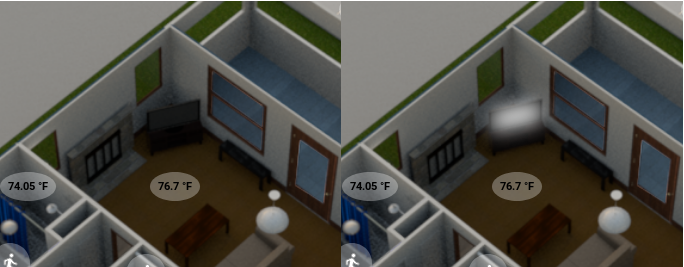
One of the other cool things about my floorplan is the ability to see at a glance if the TV is on or off. Additionally clicking on the TV will toggle it on/off. You can see below on the left what the TV looks like when it is off versus the right when it is on.
This is accomplished similar to the lights where there is an overlay image that is the same size as the base image and then a separate element for toggling the TV.
- type: image
  entity: switch.tv_power
  tap_action: none
  hold_action: none
  state_image:
    "on": /local/floorplan/first_floor_tv_on.png
    "off": /local/floorplan/transparent_square.png
  style:
    top: 50%
    left: 50%
    width: 100%

# TV Toggle
- type: image
  entity: switch.tv_power
  tap_action:
    action: toggle
  image: /local/floorplan/transparent_square.png
  style:
    top: 35.2%
    left: 49.1%
    width: 3%
    height: 3%
The on image for the TV state is simply a semi-transparent white rectangle that is slightly larger than the TV and has a gaussian blur.
I also manually adjusted the width and height of the tv toggle so that it’s a
rectangle that more or less encompases the TV in the floorplan.
To create the actual switch I used a command_line platform switch. I have a
raspberry pi connected to my TV that has the cec-client
installed. I run a command over SSH to get the status of the TV. You can see
the switch below (with the IP address obfuscated).
configuration.yaml
switch:
  - platform: command_line
    switches:
      tv_power:
        command_on: "ssh -o ConnectTimeout=2 root@19x.xxx.x.xxx -i /config/my.key -o StrictHostKeyChecking=no 'echo on 0 | cec-client -s -d 1'"
        command_off: "ssh -o ConnectTimeout=2 root@19x.xxx.x.xxx -i /config/my.key -o StrictHostKeyChecking=no 'echo standby 0 | cec-client -s -d 1'"
        command_state: "tvstatus() { local RESULTS; RESULTS=$(ssh -o ConnectTimeout=2 root@19x.xxx.x.xxx -i /config/my.key -o StrictHostKeyChecking=no \"echo pow 0 | cec-client -s -d 1 | grep -q 'power status: on'\"); echo $?; }; tvstatus"
        value_template: '{{ value == "0" }}'
        friendly_name: Downstairs TV
Wrap Up
It took me quite some time to figure out how to do all of the cool things I’ve documented above. I hope this helps out others who want to add a 3D floorplan to their home assistant installation.